introduction; I was asked to create a new tablet or phone cover design inspired by a hobby of our choosing. I was inspired by Star Wars and below is 3 of my designs that i hope would appeal. So my designs are mainly to anyone who likes Star Wars, any age and Male or Female.

DESIGN 1 = MOSAIC SITH EMPIRE SYMBOL
This is my first attempt. I drew my design on paper and then designed it in Photoshop. I used a variety of shapes to make the symbol. With my symbol complete, I made a zig and zag pattern of black and red. The down side is it did take time to make but it was worth it in the end. This would be successful for my target audience because it won't just appeal to Star Wars fans, but to other audiences as my symbol has the likeness of the spokes of a wheel or the pattern of Spanish and Italian mosaic tiles. I like this because it is spectacular to look at. I could improve on it maybe by using pastels, outlining the shapes or using different shapes.
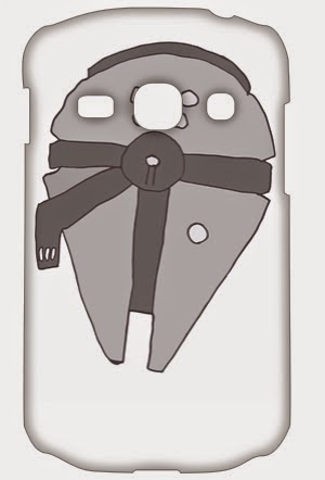
DESIGN 3 = MILLENIUM FALCON
This is my final attempt. I drew my design on paper and then scanned it into the computer. I used illustrator to used path trace to draw the outline of each shape to colour the shapes in. This would be successful for my target audience because it would appeal to Star Wars fans as the outline of the MILLENNIUM FALCON is recognisable. I like this because it has cartoon qualities . What I don't like about it is that it looks basic. I could improve it by added realistic affects like shadows and textured pattern.

This is my second attempt. I drew my design on paper and then designed it in Photoshop. I used a variety of shapes to make the R2 D2 shape. With my R2 shape complete, I made a checker board pattern and used white and red - white and blue. This would be successful for my target audience because it would appeal to Star Wars fans as it is easily recognisable. There isn't a lot about it that I don't like about it. I like this design because it is good and easily laid out. I could improve it by design it a collection of individual characters.
No comments:
Post a Comment