The Mr. Nutcase company (my clients in question) are graphic design
specialists who make art designs for various clients such as the general public
who want personalises designs for everyday domestic objects from mobile phone
cases to crash helmets. I was asked to create a new tablet or phone cover design inspired by a hobby of our choosing.
Since I did my designs based around star
wars. So my designs are mainly to anyone who likes Star Wars at any age and either
Male or Female.
The research I did included looking at the
Mr. Nutcase Company and their designs they do for whoever pays and the same from
I Love Dust.

 I did have to do some designs on paper of the
first ideas and then refined by scanning and using computer software. I used
adobe Photoshop and Illustrator as my computer editing software. My development
of 2 of my 3 designs looked suitable of a pattern so I duplicated and
rearranged my designs into a pattern. I also change the colours of the designs
to make my patterns more vibrant and lively.
I did have to do some designs on paper of the
first ideas and then refined by scanning and using computer software. I used
adobe Photoshop and Illustrator as my computer editing software. My development
of 2 of my 3 designs looked suitable of a pattern so I duplicated and
rearranged my designs into a pattern. I also change the colours of the designs
to make my patterns more vibrant and lively.
2 of my designs were made using various
shapes, which were created to my designs. This meant experimenting with
different shapes, some of the shapes worked and some didn’t.
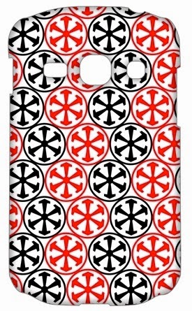
DESIGN 1 = MOSAIC SITH EMPIRE SYMBOL
This is my first attempt. I drew my design on paper
and then designed it in Photoshop. I used a variety of shapes to make the
symbol. With my symbol complete, I made a zig and zag pattern of black and red.
The down side is it did take time to make but it was worth it in the end. This
would be successful for my target audience because it won't just appeal to Star
Wars fans, but to other audiences as my symbol has the likeness of the spokes
of a wheel or the pattern of Spanish and Italian mosaic tiles. I like this
because it is spectacular to look at. I could improve on it maybe by using
pastels, outlining the shapes or using different shapes.

DESIGN 3 = MILLENIUM FALCON
This is my final attempt. I drew my design on paper
and then scanned it into the computer. I used illustrator to used path
trace to draw the outline of each shape to colour the shapes in. This would be
successful for my target audience because it would appeal to Star Wars fans as
the outline of the MILLENNIUM FALCON is recognisable. I
like this because it has cartoon qualities . What I don't like about it is that
it looks basic. I could improve it by added realistic affects like shadows and
textured pattern.

DESIGN 2 = CHECKERBOARD OF 2 COLOURED R2D2S
This is my second attempt. I drew my design on paper
and then designed it in Photoshop. I used a variety of shapes to make the R2 D2
shape. With my R2 shape complete, I made a checker board pattern and used
white and red - white and blue. This would be successful for my target audience
because it would appeal to Star Wars fans as it is easily recognisable. There
isn't a lot about it that I don't like about it. I like this design because it
is good and easily laid out. I could improve it by design it a collection of
individual characters.
My overall conclusion is that I think I've met the brief and that my designs are good for any phone or tablet case.
No comments:
Post a Comment