Wednesday 20 May 2015

the Urban juicer company

The Urban Juicer company

Our mission

We at the The Urban Juicer believe that our food can be beautiful inside and out. Food that is good for you can taste good too- all by itself, no fillers or additives. We strive to let the beauty of nature shine by offering healthy food options and spend loving time creating new and exciting recipes.

Our Vision

We believe that consumers have a right to expect healthy options in the market of fast food. We believe in providing exceptional quality in the food that we create as we continue to develop inspired, whole food recipes without additives or preservatives. We believe that creating healthy food options creates better communities and is a crucial part of the balance of growth and well-being in our nation.
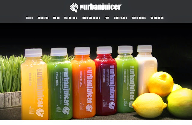
Our Juice

At the Urban Juicer, we want to make the juice that’s right for you. We love being able to offer you a completely customizable juicing experience, every time you come in. We believe that the freshest fruits and vegetables make the best juice. Juice should never be cooked. Pasteurization kills vitamins, minerals, and live enzymes. Here at the Urban Juicer, we like to say, “Don’t settle for juice that doesn’t settle.” Only additives can prevent the natural settling process that occurs in juice, and who wants to drink additives?

Make The Urban Juicer Part of Your Life

maintaining a diet rich in whole foods and natural produce is the best way to maintain a healthy body and mind. We thrive when we live a healthy, balanced lifestyle, but at The Urban Juicer, we recognize how difficult it can be to maintain your healthy, whole food diet, when you’re busy and on the go. Let us help! Juicing is a super punch of nutrition that allows you to maintain your busy lifestyle and still get the nutrition your body needs.

Connecting with our Customers

The folks who make your juice live in the juicing world, they are knowledgeable and actively juicing themselves. It’s not just a job, it’s a calling, and we continue to work with our employees to discover new inspirations everyday. We are inspired as we see our customers get healthier and find more balance. Our clients’ health and nutrition is our highest priority. We have a team of juicers that are committed to providing professional nutritional guidance as you discover how juicing works best for you.

My view.
I think that the Urban Juicer is a company that takes its roll to promoting healthy living very seriously and for wanting product placement, it is a good place to start.

Wednesday 13 May 2015

My Finale of Mr.nutcase Evaluation

The Mr. Nutcase company (my clients in question) are graphic design specialists who make art designs for various clients such as the general public who want personalises designs for everyday domestic objects from mobile phone cases to crash helmets. I was asked to create a new tablet or phone cover design inspired by a hobby of our choosing. 

Since I did my designs based around star wars. So my designs are mainly to anyone who likes Star Wars at any age and either Male or Female.

The research I did included looking at the Mr. Nutcase Company and their designs they do for whoever pays and the same from I Love Dust.
 
I did have to do some designs on paper of the first ideas and then refined by scanning and using computer software. I used adobe Photoshop and Illustrator as my computer editing software. My development of 2 of my 3 designs looked suitable of a pattern so I duplicated and rearranged my designs into a pattern. I also change the colours of the designs to make my patterns more vibrant and lively.

2 of my designs were made using various shapes, which were created to my designs. This meant experimenting with different shapes, some of the shapes worked and some didn’t.
 
DESIGN 1 = MOSAIC SITH EMPIRE SYMBOL
This is my first attempt. I drew my design on paper and then designed it in Photoshop. I used a variety of shapes to make the symbol. With my symbol complete, I made a zig and zag pattern of black and red. The down side is it did take time to make but it was worth it in the end. This would be successful for my target audience because it won't just appeal to Star Wars fans, but to other audiences as my symbol has the likeness of the spokes of a wheel or the pattern of Spanish and Italian mosaic tiles. I like this because it is spectacular to look at. I could improve on it maybe by using pastels, outlining the shapes or using different shapes. 
 

DESIGN 3 = MILLENIUM FALCON
This is my final attempt. I drew my design on paper and then scanned it into the computer. I used illustrator to used path trace to draw the outline of each shape to colour the shapes in. This would be successful for my target audience because it would appeal to Star Wars fans as the outline of the MILLENNIUM FALCON is recognisable. I like this because it has cartoon qualities . What I don't like about it is that it looks basic. I could improve it by added realistic affects like shadows and textured pattern. 


DESIGN 2 = CHECKERBOARD OF 2 COLOURED R2D2S

This is my second attempt. I drew my design on paper and then designed it in Photoshop. I used a variety of shapes to make the R2 D2 shape. With my R2 shape complete, I made a checker board pattern and used white and red - white and blue. This would be successful for my target audience because it would appeal to Star Wars fans as it is easily recognisable. There isn't a lot about it that I don't like about it. I like this design because it is good and easily laid out. I could improve it by design it a collection of individual characters.

My overall conclusion is that I think I've met the brief and that my designs are good for any phone or tablet case.

Mr. Nutcase research


The Mr. Nutcase company are graphic design specialists who make art designs for various clients such as the general public who want personalises designs for everyday domestic objects from mobile phone cases to crash helmets.

The research I did included looking at the Mr. Nutcase Company and their designs they do for whoever pays 

Wednesday 6 May 2015

MY PROTOTYPE DESIGNS

introduction; I was asked to create a new tablet or phone cover design inspired by a hobby of our choosing. I was inspired by Star Wars and below is 3 of my designs that i hope would appeal. So my designs are mainly to anyone who likes Star Wars, any age and Male or Female.


DESIGN 1 = MOSAIC SITH EMPIRE SYMBOL
This is my first attempt. I drew my design on paper and then designed it in Photoshop. I used a variety of shapes to make the symbol. With my symbol complete, I made a zig and zag pattern of black and red. The down side is it did take time to make but it was worth it in the end. This would be successful for my target audience because it won't just appeal to Star Wars fans, but to other audiences as my symbol has the likeness of the spokes of a wheel or the pattern of Spanish and Italian mosaic tiles. I like this because it is spectacular to look at. I could improve on it maybe by using pastels, outlining the shapes or using different shapes. 
DESIGN 3 = MILLENIUM FALCON
This is my final attempt. I drew my design on paper and then scanned it into the computer. I used illustrator to used path trace to draw the outline of each shape to colour the shapes in. This would be successful for my target audience because it would appeal to Star Wars fans as the outline of the MILLENNIUM FALCON is recognisable. I like this because it has cartoon qualities . What I don't like about it is that it looks basic. I could improve it by added realistic affects like shadows and textured pattern. 
DESIGN 2 = CHECKERBOARD OF 2 COLOURED R2D2S
This is my second attempt. I drew my design on paper and then designed it in Photoshop. I used a variety of shapes to make the R2 D2 shape. With my R2 shape complete, I made a checker board pattern and used white and red - white and blue. This would be successful for my target audience because it would appeal to Star Wars fans as it is easily recognisable. There isn't a lot about it that I don't like about it. I like this design because it is good and easily laid out. I could improve it by design it a collection of individual characters.